List Filter
 This article describes the filtering controls provided by the Vitextra Filter web part for SharePoint and the column types each supports.
Introduction
The Vitextra List Filter web part provides more than ten specialized filtering controls for searching data in SharePoint lists and document libraries. You can use native SharePoint controls such as the People Picker and Term Picker, as well as specialized ones like Autocomplete and List with multiple selections.
The Vitextra Filter web part works with any type of SharePoint list — task lists, document libraries, image libraries, contacts, custom lists, and more.
Filtering Controls
The Vitextra Filter web part has 14 controls. Some can filter several column types, while others are designed for specific column types — for example, the People Picker and the Yes/No control.
Text
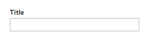
The Text control filters a column by a text value, returning only the items whose column contains the filter text. If the control has no value, it is ignored.
📝 Note
The filter query generated by the Vitextra Filter web part is case-insensitive.
For example, the filter criteria Vitextra and VITEXTRA are the same.
Supported column types:
- Single line of text
- Multiple lines of text
- Choice (Multi Choice)
- Number
- Currency
- Lookup
- Hyperlink or Picture
- Calculated
- Computed
- Managed Metadata
- Approval Status
📝 Note
Filtering a lookup column works by its Value, not its ID.
Text with options

The Text with options control lets you choose the operator used to search the data. The operator specifies how the filter value is compared to the column value. The filter operators supported by the List Filter web part are listed in the following table:
| Operator | Uses |
|---|---|
| is equal to | Use for an exact match. |
| does not equal to | Returns items that don't have the value you enter. |
| begins with | Use when you know what the column value starts with. |
| is greater than | Returns items whose column value is greater than the value you enter. |
| is greater than or equal to | Returns items whose column value is greater than or equal to the value you enter. |
| is less than | Returns items whose column value is less than the value you enter. |
| is less than or equal to | Returns items whose column value is less than or equal to the value you enter. |
Supported column types:
- Single line of text
- Multiple lines of text
- Choice (Multi Choice)
- Number
- Currency
- Lookup
- Hyperlink or Picture
- Calculated
- Computed
- Approval Status
Autocomplete
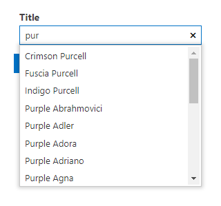
The Autocomplete control shows up to 20 suggestions after the user types at least one character.
❗ Important
Suggestions provided by the Autocomplete control may include values from items the current user doesn't have permission to view.
Supported column types:
- Single line of text
- Person or Group
- Managed Metadata
List
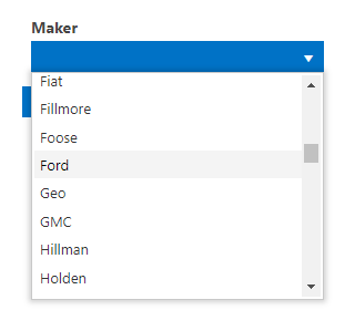
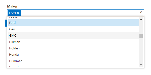
The List control lets you select one or more of the values present in the column to filter the data. The options are generated from the column's unique values.
The List control can also filter by approval status:
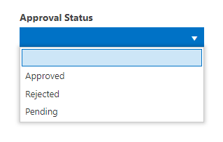
Supported column types:
- Single line of text
- Choice
- Lookup
- Person or Group
- Managed Metadata
- Approval Status
💡 Tip
Avoid the List control when a column has a large number of unique values, as it can hurt UI performance. Use the Autocomplete control instead.
Date
This filtering control can be applied only to Date and Time columns.
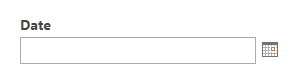

The Date control filters a column by a specific date or a date range.
💡 Tip
With the Date Range control, you can specify only the minimum or only the maximum value. This is equivalent to the "is greater than or equal to" and "is less than or equal to" filters, respectively.
User or Group


The User or Group control lets you pick user-related entities such as a User, SharePoint Group, or AD Group. The filter returns only the items where the column matches the selected value (or any of them, for multiple selections).
Yes/No
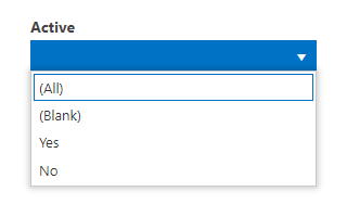
A filtering control for choosing one of the following options to filter list items or documents:
- (All) — returns all items.
- (Blank) — returns only the items where the column has no value.
- Yes — returns only the items where the column is Yes.
- No — returns only the items where the column is No.
Taxonomy Term
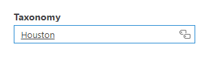
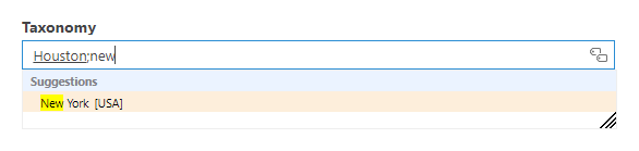
A filtering control that provides the native SharePoint Term Picker for choosing one or more taxonomy terms.
Slider
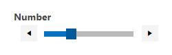
The Slider lets you set the filter value by choosing a point in the range between the column's minimum and maximum values.
Supported column types:
- Number
- Currency
Number Range
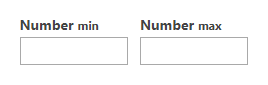
The Number Range control filters Number and Currency columns by a minimum and/or maximum value.
💡 Tip
With the Number Range control, you can specify only the minimum or only the maximum value. This is equivalent to the "is greater than or equal to" and "is less than or equal to" filters, respectively.
Supported column types:
- Number
- Currency
Matrix
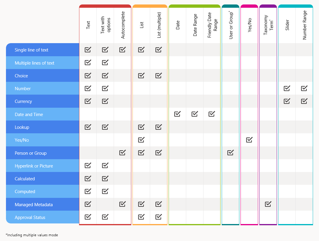
The matrix below shows the supported SharePoint column types and the filtering controls that can be applied to each: