Change Color Theme for Vitextra Filter Web Part
This article describes how to change the color scheme for Vitextra List Filter.
Introduction
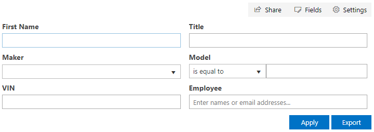
Vitextra List Filter Web Part allows building custom filtering panel to search for data within SharePoint List and Document Library. The filtering panel contains controls such as buttons, lists, labels, and others. This article describes how to change the appearance of the Filter Web Part according to your corporate portal branding or theme.
HTML controls provided by List Filter have specific CSS classes that can be used to apply your color theme.
Apply Styles
To apply custom style to the Filter Web Part you need to register your custom CSS on the page. The simplest way to achieve this goal is to add a Script Editor web part to the page where the filter is presented.
To add a Script Editor Web Part open the page in edit mode, put the cursor inside the web part zone, go INSERT - Web Part, and choose Script Editor Web Part under Media and Content category:
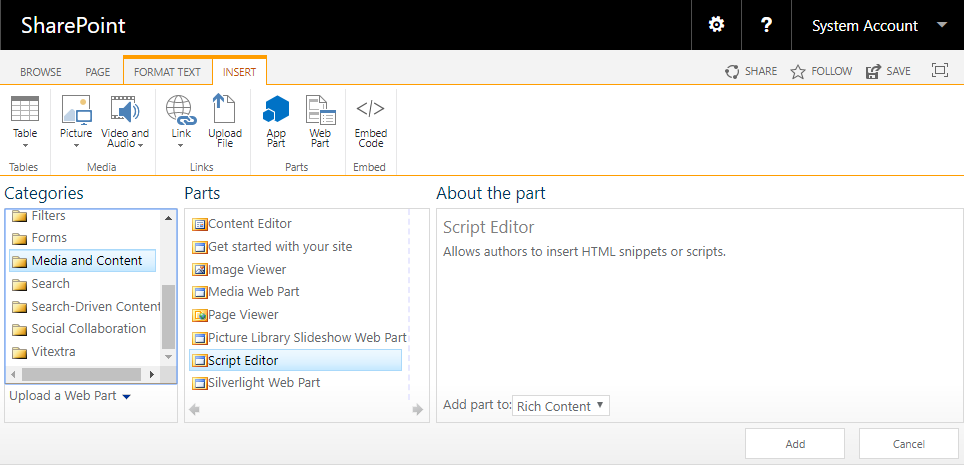
Click Add button to insert the web part to the page.
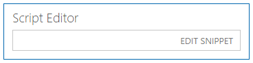
Click EDIT SNIPPER on the Script Editor Web Part.
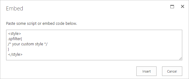
In the snippet dialog paste your styles and click Insert
💡 Tip
Add Script Editor Web Part at the bottom of the page to avoid empty space in a significant part of the page.
CSS References
| Element | Reference | Parent |
|---|---|---|
| Filter Panel | .spfilter | |
| Toolbar Panel | .spfilter-toolbar | .spfilter |
| Action Buttons Panel | .spfilter-footer | .spfilter |
| Filter Button | .spfilter-button-filter | .spfilter-footer |
| Export Button | .spfilter-button-export | .spfilter-footer |
| Fields Container | .spfilter-fields | .spfilter |
| Field | .spfilter-field | .spfilter-fields |
| Field Label | .spfilter-field-label | .spfilter-field |
| Filtering Control | .spfilter-field-input | .spfilter-field |
| List Control | .k-dropdown-wrap | .spfilter-field-input |
📝 Note
Do not override List control styles directly via .k-dropdown-wrap selector. Instead, use .spfilter .k-dropdown-wrap one.
Examples
Here are some examples of how to apply custom styles to the List Filter Web Part.
Change Color Scheme
There are six colors you can override in the Filter Web Part:
- primary (#0072c6)
- primary on hover (#004c84)
- primary on active (#00467a)
- secondary (#f4f4f4)
- secondary on hover (#e2e2e2)
- secondary on active (#0072c6)
The primary color is used for Filter and Export button, second is used for toolbar buttons Share, Fields, Settings.
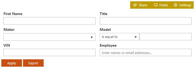
Example #1. Change the color scheme to orange
<style>
/* Color of the primary buttons */
.spfilter-footer button {
  background-color: #ca5010 !important;
  border-color: #ca5010 !important;
}

.spfilter-footer button:hover {
  background-color: #da3b01 !important;
  border-color: #da3b01 !important;
}

.spfilter-footer button:active {
  background-color: #a4262c !important;
  border-color: #a4262c !important;
}

/* Color of the secondary buttons */
.spfilter-toolbar button,
.spfilter-toolbar button:hover{
  background-color: #c19c00 !important;
  border-color: #c19c00 !important;
  color: #fff !important;
}

.spfilter-toolbar button:active {
  background-color: #ca5010 !important;
  border-color: #ca5010 !important;
}
</style>
Result:
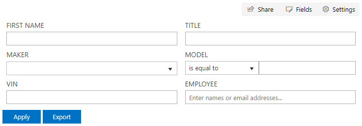
Change Label Style
Example #2. Change field label style
<style>
/* Field Label Style */
.spfilter-field-label {
  font-weight: normal;
  text-transform: uppercase;
}
</style>
Result:
Color of the List
Example #3. Change the color of List control
<style>
/* Active List Style */
.spfilter .k-dropdown-wrap.k-state-active {
  background-color: #ca5010 !important;
  border-color: #ca5010 !important;
}

/* Selected Item Style */
.spfilter .k-list>.k-item.k-state-focused {
  background-color: #c19c00 !important;
  border-color: #c19c00 !important;
  color: #fff !important;
}
</style>
Result:
Alignment of the buttons
Example #4. Move the Filter and Export buttons to the right
<style>
/* Buttons position */
.spfilter-footer {
  text-align: right;
}
</style>
Result: