 Smart Tiles
 Introduction
This article walks through the first steps with Smart Tiles: deploying the web part, adding it to a modern SharePoint Online page, and the settings of the property pane that apply to the whole panel. The properties of individual tiles — texts, links, colors, icons — are covered in KB10242. How to Add and Edit a Tile in Smart Tiles.
Before you begin
Smart Tiles is deployed to the tenant once, by a SharePoint administrator, from the tenant app catalog. The package is deployed tenant-wide, so the web part becomes available on every site without being added to each site separately. The procedure is described in KB10035. Installing Cloud-based Product.
To add the web part to a page you need permission to edit that page — the Edit permission level or membership in the Members group of the site is sufficient.
📝 Note
Smart Tiles works on modern pages only. On a site that still uses classic pages, create a modern site page first.
Adding the web part to a page
- Open the page and click Edit in the top-right corner.
- Hover over the place where the panel should go until a line with a + sign appears between the sections or web parts, and click it to open the web part gallery.
- Type Smart Tiles in the search box and click the web part.
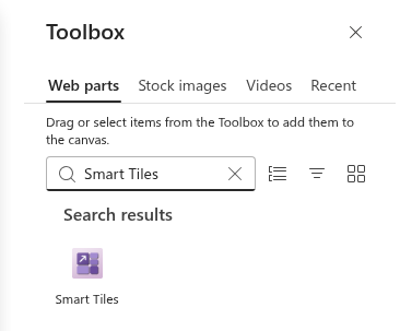
The web part appears on the page with three sample tiles that link to Vitextra product pages. They show what a tile looks like and can be edited into your own links or removed.

The web part title
Above the tiles there is a title field. Click it and type a heading for the panel, for example Quick Links or HR Services. The title is optional: leave it empty and no heading is shown on the published page.
Appearance settings
Click the pencil icon (Edit web part) on the left of the web part to open the property pane. The Appearance group holds the settings that apply to every tile.
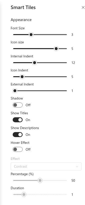
| Setting | Description |
|---|---|
| Font Size | Size of the tile title, in seven steps from 14 px to 32 px. The description, when shown, is scaled down proportionally. |
| Icon size | Size of the icon, in six steps from 20 px to 64 px. Custom icon images use the same sizes. |
| Internal Indent | Space above and below the content of a tile, 0–30 px. Larger values make the tiles taller. |
| Icon Indent | Space between the icon and the title, 0–30 px. |
| External Indent | Space between neighboring tiles, 0–30 px. At 0 the tiles touch each other and form a solid mosaic. |
| Shadow | Draws a soft drop shadow under the icons. |
| Show Titles | Shows or hides the titles of all tiles. With titles hidden the icons are centered in the tiles. |
| Show Descriptions | Shows or hides the descriptions of all tiles. Descriptions remain available in the tooltips. |
| Hover Effect | Enables a visual effect when the pointer rests on a tile. The Effect list, the strength slider and Duration appear below the toggle. |
The sliders and toggles are applied to the page immediately, so the result can be judged while changing them.
💡 Tip
The sizes, indents and texts are described in detail in KB10247. Tile Sizes and Layout in Smart Tiles and KB10249. Showing Titles and Descriptions on Tiles; the hover effects in KB10248. Configuring the Hover Effect for Tiles.
The About group
The About group of the property pane shows the license of the web part: the Status (trial, active, expired or suspended), the Version of the web part, the Start Date of the subscription and the Tenant it is assigned to. During the trial the number of remaining days is shown here as well. The group also links to the product page where a subscription can be purchased.
📝 Note
When a newer version of Smart Tiles is available, a notice appears above the tiles in edit mode. The update is installed by uploading the new package to the app catalog; the pages and their tiles are not affected.
Placing the panel in a full-width section
Tiles make the strongest impression when they span the whole screen. To achieve this, put the web part into a full-width section:
- In edit mode, hover over the left edge of the page and click the + that appears between sections.
- Choose Full-width section from the list of layouts.
- Drag the Smart Tiles web part from its current section into the new one, or add a new Smart Tiles web part into the full-width section.
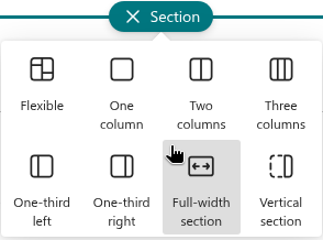
Smart Tiles also fits a one-column or two-column section, and several Smart Tiles web parts can share a page — for example one panel per department. Each web part keeps its own settings and hover effect.
❗ Important
Full-width sections are available on communication sites and on team sites with the modern home page layout. On a page without full-width sections the tiles fill the width of the section they are in.
Saving the page
Tiles and settings are stored in the page. Click Save as draft to keep working later, or Republish to make the panel visible to visitors. Until the page is republished, visitors see its previous version.
Learn more about the product: https://vitextra.com/en/products/smart-tiles