 Organizational Chart
 Introduction
Every company has an organizational structure, and every employee needs it at some point: a new hire wants to understand who reports to whom, a manager wants to see the shape of a neighboring department, and HR wants a current chart for a presentation without redrawing it by hand. The problem is that a chart drawn in a slide deck is out of date the moment someone changes roles.
Vitextra Organizational Chart solves this by building the chart automatically from the directory you already maintain. The web part reads the manager attribute of every user profile in Microsoft Entra ID and renders the company hierarchy as an interactive tree on a SharePoint Online page or in Microsoft Teams. There is no separate data source to maintain: when a reporting line changes in the directory, the chart changes with it.
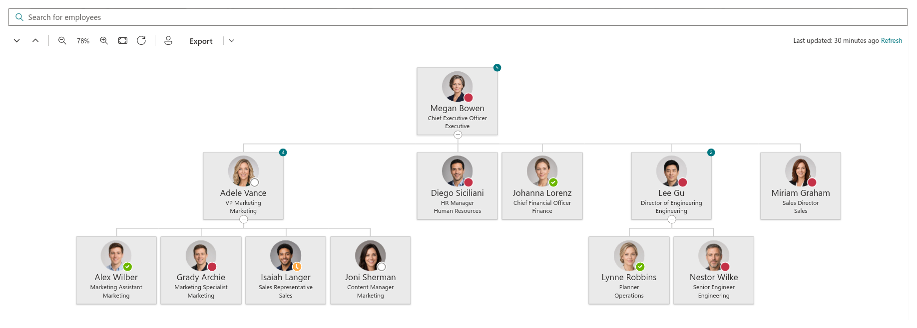
This article gives an overview of what the web part does and how its main features fit together. For step-by-step setup instructions, see KB10233. How to Add and Configure the Organizational Chart Web Part; for a walkthrough aimed at end users, see KB10234. Organizational Chart: A Quick Guide for End Users.
Built from your directory
The web part is built on the SharePoint Framework and retrieves employee data through the Microsoft Graph API. It loads the active member accounts of your tenant together with their manager relationships, and then arranges them into a tree: a person whose manager is another employee becomes a child node of that employee, and so on down the hierarchy.
Because the structure is derived from the Manager field, the quality of the chart depends directly on the quality of your directory. If the manager is set for every employee except the head of the company, the chart has a single root and clean branches. If several people have no manager assigned, each of them becomes a separate root at the top of the chart.
📝 Note
Guest accounts and external users are never included — the chart only shows member accounts of your organization. Disabled accounts are hidden by default, and accounts without an assigned license or without a job title are also excluded by default; an administrator can change these rules in the web part settings.
The employee data is loaded once and kept in the browser for up to 12 hours, so reopening the page is fast and does not put extra load on Microsoft Graph. The Last updated time is shown above the chart together with a Refresh link that reloads the data on demand. Employee photos and presence status are loaded lazily — only for the cards that are actually visible on screen — which keeps the chart responsive even in organizations with thousands of employees.
Two chart modes
The web part can show the whole organization or just one part of it:
- Entire Company — the chart starts from the employees who have no manager (typically the CEO or the executive team) and shows the full hierarchy beneath them. This is the mode for the intranet home page or the About the company section.
- Employees reporting to specific user — the chart starts from a person you select and shows everyone who reports to them, directly or indirectly. This mode is the right choice for a department site or a team page, where only one branch of the organization is relevant.
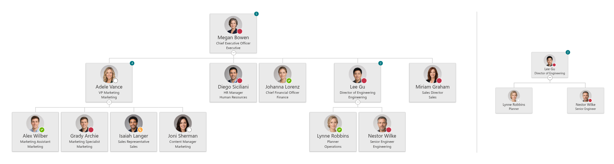
In both modes, you choose how many levels of the hierarchy are expanded when the page opens — from 1 to 10. Deeper levels stay collapsed until a visitor expands them, which keeps a large chart readable.
Layouts and employee cards
The chart is available in two layouts:
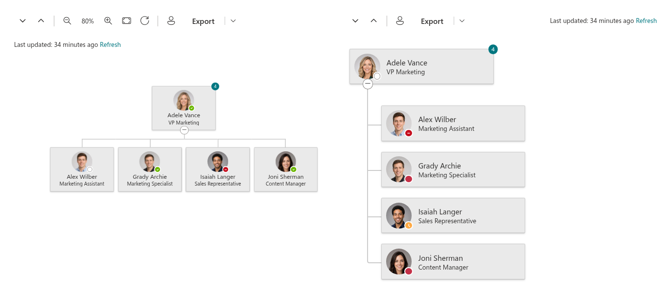
- Horizontal — the classic top-down organizational tree. Visitors can pan the chart by dragging it and zoom in and out, which makes it well suited to wide page sections and full-width layouts.
- Vertical — a compact nested list where each level is indented under its parent. It takes less horizontal space and works well in narrow columns and on mobile screens.
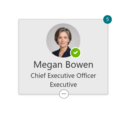
Each employee is represented by a card. The card size has four levels, from a compact card with just the name to a large card with a photo and three lines of information. You decide which attributes those lines show: the header, secondary and tertiary fields can each be set to any of fifteen profile attributes — full name, job title, department, e-mail, cell phone, office location, city, country, employee ID and others. A department site might show the job title and the phone number, while an office directory might prefer the office location and the e-mail address.
Cards also show the employee's photo and a real-time Microsoft Teams presence indicator — Available, Busy, Away, Do not disturb or Offline — so colleagues can see whether this is a good moment to get in touch. Hovering over a card opens the standard Microsoft 365 profile card with contact details and actions such as starting a chat or sending an e-mail. Optionally, a badge on each card can show the number of the person's direct reports.
Navigating the chart
A toolbar above the chart gives visitors everything they need to move around a large structure:
- Expand all and Collapse all — open or close the whole tree in one click.
- Zoom in, Zoom out and the current zoom level in percent (from 20% to 200%), plus Fit to screen, which picks the scale at which the whole chart fits the width of the page, and Reset view, which returns to 100% and the original position. Holding Ctrl (or ⌘ on a Mac) while scrolling the mouse wheel also zooms the chart, while scrolling without the key scrolls the page as usual.
- Find me — locates the signed-in user in the hierarchy, expands the chain of managers above them, highlights their card and scrolls it into view. It is a quick answer to "where am I in this structure?" and a favorite of new employees.
- Export — saves the chart as a file (see below).
Individual branches are expanded and collapsed with the chevron under each card, which is also operable from the keyboard.
Search and filtering
The search box above the chart filters the tree as you type. It matches the name, job title, department, e-mail, employee ID, city, state and country of every employee; matching cards are highlighted and the branches that contain them are expanded automatically, so a result is never hidden inside a collapsed node.
For administrators, the web part offers a Filter section in the property pane. A query builder lets you combine conditions on any of the card attributes with And/Or logic and operators such as is equal to, contains, begins with, contains data and their negations — for example, to show only the employees of two departments, or to leave out service accounts whose job title contains a certain word. Three quick toggles additionally exclude employees without a license, with a blank department or with a blank job title.
💡 Tip
A typical use of filtering is to show a single department on its own site. See KB50026. How to Filter the Organizational Chart to Show a Specific Department for a worked example.
Export to PDF and JPEG
The chart can be exported to a PDF document or a JPEG image with one click. The export always captures the complete tree — every root and every branch as currently expanded, not only the part that happens to be visible on screen — and the PDF page orientation is chosen automatically to match the proportions of the chart. An administrator decides which of the two formats are offered to visitors.
Microsoft Teams
Organizational Chart ships as a Microsoft Teams application. It can be installed as a personal app, where every employee opens the company chart from the Teams sidebar, or added as a tab to a channel so that a team always has its own structure at hand. The data, the layouts and the navigation are exactly the same as on a SharePoint page.
In Teams, an administrator can save the current settings as the tenant-wide default, so that every user of the personal app sees the same, consistently configured chart without configuring anything themselves.

Themes and languages
The web part follows the theme of the SharePoint site, including the color variant of the page section it is placed in, and switches to dark mode together with the Teams client. It supports full-width sections and is fully responsive.
The user interface is available in 34 languages, selected automatically from the language of the SharePoint site or the Teams client.
System requirements
| Platform | SharePoint Online (Microsoft 365) |
| Hosts | SharePoint modern pages, full-page apps, Microsoft Teams personal app and channel tabs |
| Data source | Microsoft Entra ID via Microsoft Graph |
| Installation | SPFx package (.sppkg) via the tenant App Catalog |
| API permissions | Directory.Read.All, User.Read.All, Presence.Read.All (Microsoft Graph) |
| Licensing | One license per tenant; the number of users does not affect the price |
❗ Important
Organizational Chart is a cloud product and does not support SharePoint Server (on-premises) environments.
💡 Tip
To deploy the web part in your environment, see KB10035. Installing Cloud-based Product. To add it to a page and configure it, see KB10233. How to Add and Configure the Organizational Chart Web Part.
Learn more about the product: https://vitextra.com/en/products/org-chart