 Organizational Chart
 Introduction
The Vitextra Organizational Chart shows your company's structure as an interactive tree built from the corporate directory: who reports to whom, which teams make up a department, and who is available right now. This guide walks end users through the chart — no administrator rights needed — from reading the cards to finding a colleague and saving the chart as a file.
📝 Note
The exact look of the chart depends on how an administrator configured it: the layout, the size of the cards, the information shown on them and the available buttons may differ from the screenshots in this article.
Reading the chart
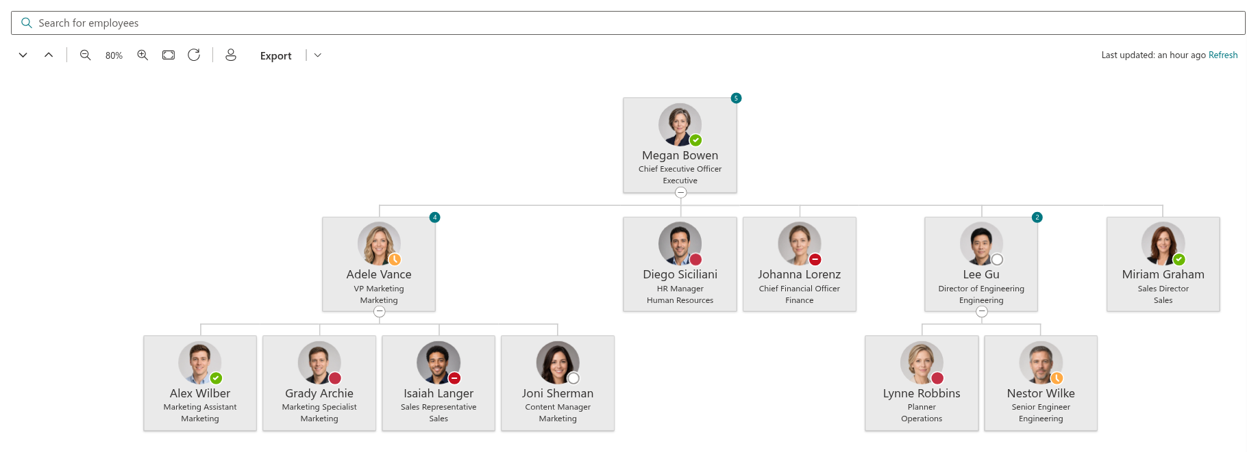
Each person in the chart is shown as a card. Depending on the configuration, a card shows the person's photo, name and up to two more lines of information — most often the job title and the department. Lines between the cards represent reporting relationships: the cards directly below a person are their direct reports.
The chart comes in one of two layouts:
- Horizontal — a classic top-down tree. The chart can be larger than the page, so you can drag it with the mouse to pan and use the zoom controls to see more or less of it at once.
- Vertical — a compact list where each level is indented under its manager. It fits in narrow columns and on phones; you scroll it like any other list.
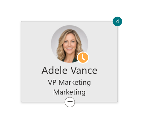
If the administrator has enabled it, a badge on the card shows how many people report directly to that person.
Expanding and collapsing branches
When the page opens, only the first few levels of the hierarchy are expanded. A person who has reports shows a chevron below their card:
- Click the chevron to expand the branch and see the person's direct reports; click it again to collapse the branch.
- The chevron can also be used from the keyboard: move the focus to it with Tab and press Enter or Space.
To open or close the whole chart at once, use the Expand all and Collapse all buttons on the toolbar.
💡 Tip
Collapse the branches you are not interested in before zooming or exporting — a chart with a few open branches is much easier to read than a fully expanded one.
Zooming and moving the chart
In the horizontal layout the toolbar offers a set of view controls:
| Control | What it does |
|---|---|
| Zoom out / Zoom in | Shrinks or enlarges the chart in 10% steps; the current scale is shown between the buttons. The scale ranges from 20% to 200%. |
| Fit to screen | Picks the scale at which the whole expanded chart fits the width of the page. |
| Reset view | Returns the chart to 100% and to its original position. |
You can also zoom with the mouse: hold Ctrl (or ⌘ on a Mac) and turn the mouse wheel over the chart. Without the key, the wheel scrolls the page as usual, so the chart never gets in the way of normal reading.
To move the chart, press and hold the left mouse button anywhere on it and drag. This is handy when a branch has been expanded beyond the edge of the page.

Finding yourself: Find me
Click Find me on the toolbar and the chart locates your own card: it expands every branch between the top of the hierarchy and you, highlights your card and scrolls it into view. It is the fastest way to answer "where am I in this structure?" — and to see your manager, your manager's manager and your peers in one glance.

📝 Note
Find me only works if you are part of the chart. On a page that shows a single department, or when the chart is filtered, your card may not be present — in that case nothing is highlighted.
Searching for a colleague
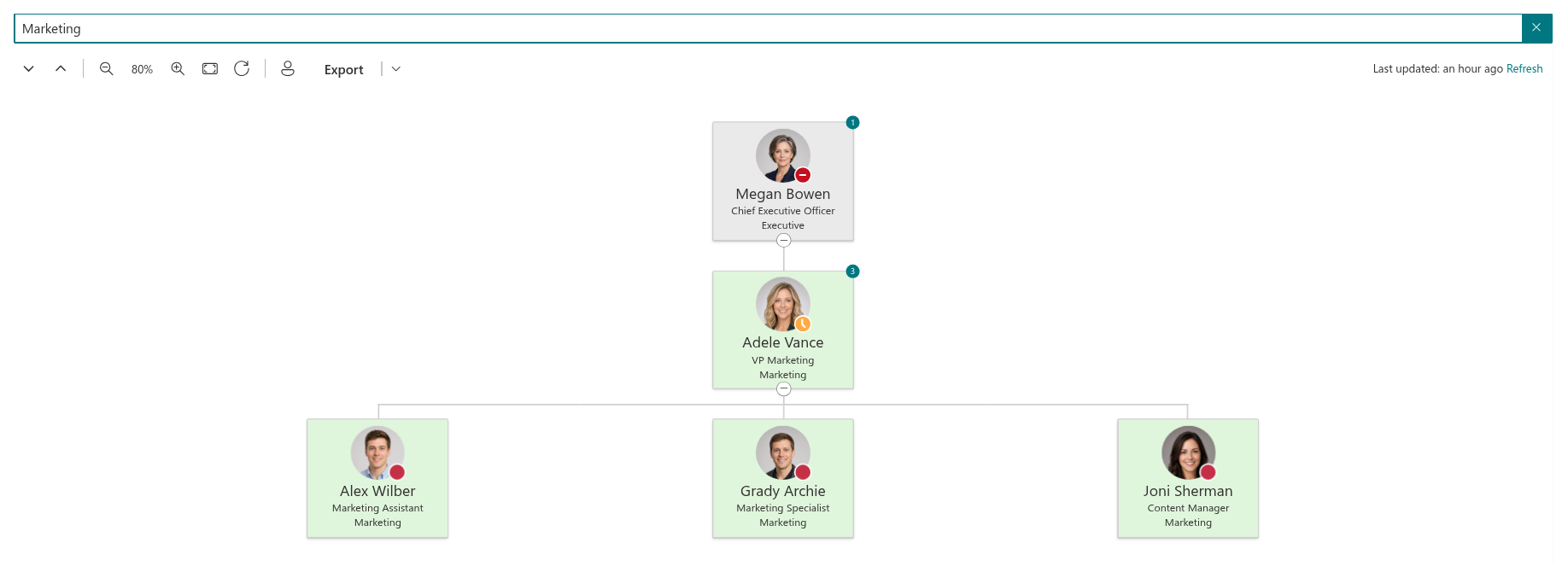
Start typing in the Search for employees box above the chart. The chart narrows as you type: cards that match the query are highlighted, and the branches that contain them are expanded automatically so that no result stays hidden in a collapsed node.
The search looks at the name, job title, department, e-mail address, employee ID, city, state and country of every person, so you can search for Anna, for Marketing or for Berlin alike. When nothing matches, the chart shows No items were found matching your query with a Clear search query button; clear the box to return to the full chart.
Presence and the profile card
The colored dot on a person's photo is their current Microsoft Teams presence: green for Available, red for Busy, a red "minus" sign for Do not disturb, yellow for Away and grey for Offline. The presence is live, so you can tell at a glance whether this is a good moment to reach out.
Hover over a card to open the standard Microsoft 365 profile card for that person. It shows their contact details, their manager and reports, and offers quick actions — start a chat, call, or send an e-mail — exactly as elsewhere in Microsoft 365.

📝 Note
Photos and presence are loaded only for the cards currently on screen, so a card that has just scrolled into view may show them with a small delay. If presence is never shown, your organization may not have granted the corresponding permission — this is a configuration matter, not an error on your side.
Refreshing the data
To keep the chart fast, the employee data is loaded once and kept in your browser for up to 12 hours. The line Last updated: above the chart shows when the data was last loaded. If you know that something has changed in the directory — a new colleague has joined or someone has moved to another team — click Refresh next to it to reload the data immediately.
Exporting the chart
Click Export on the toolbar to save the chart as a file. The main part of the button exports in the default format; the arrow next to it opens a menu with the available formats:
- PDF — a document with the chart on a single page; the page orientation (portrait or landscape) is chosen automatically to match the chart.
- Jpeg — an image you can paste into a presentation or a document.
The export includes the entire chart as it is currently expanded — every root and every open branch, not only the part visible on screen — so expand or collapse the branches you need before exporting.
📝 Note
The Export button and the list of formats are controlled by the administrator and may not be available on every page.
Organizational Chart in Microsoft Teams
If your organization has added Organizational Chart to Microsoft Teams, you will find it in the Apps list of Teams or already pinned to the left sidebar, and possibly as a tab in your team's channel. Everything in this guide works the same way there: the cards, the search, Find me, zooming and export. The chart follows the Teams theme, including dark mode.
💡 Tip
For an overview of the product and its features, see KB10232. Organizational Chart. Solution Overview. Administrators configuring the chart will find the settings described in KB10233. How to Add and Configure the Organizational Chart Web Part.
Learn more about the product: https://vitextra.com/en/products/org-chart