 Smart Tiles
 Introduction
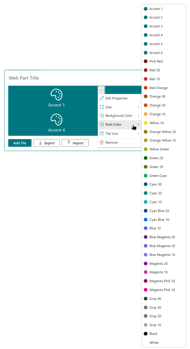
Color is the fastest way to group tiles and to make a panel look like part of the site rather than an addition to it. Every tile in Smart Tiles has a Background Color and a Font Color, both chosen from the same palette: six accent colors that follow the theme of the site, thirty-one predefined colors, black and white. This article lists the colors, explains how the accent colors behave and suggests how to combine them.
Choosing a color
- Open the page in edit mode and click the … button of the tile.
- Point to Background Color or Font Color.
- Click a color in the submenu. Each entry shows a circle in its color; the current color is marked with a filled check box.
The change is applied at once. The two menus hold the same colors, so any color can be used for the background of one tile and the text of another.
A new tile starts with Accent 1 as the background and White as the font color.
Accent colors
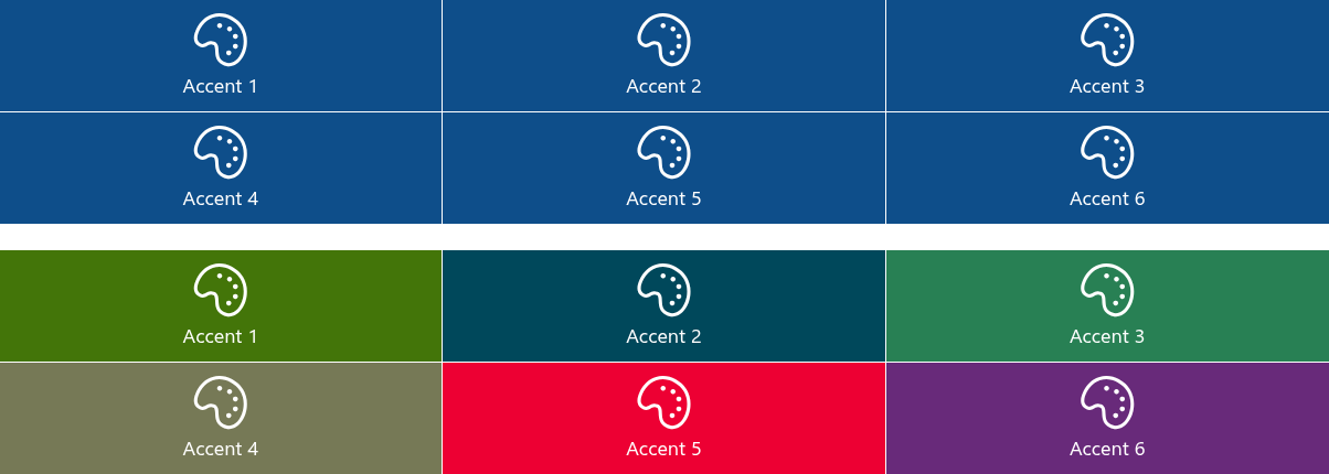
Accent 1 to Accent 6 are not fixed colors. They refer to the six content accent colors of the theme applied to the site, so a tile with an accent color changes together with the theme: switch the site from the blue theme to the green one, and every Accent 1 tile turns green with it. Panels built with accent colors therefore look at home on any site they are copied to, and survive a rebranding without being edited.
Where the six accent colors come from:
- Modern themes created in the SharePoint admin center or with the theme generator define all six content accents; each theme has its own set.
- Custom themes may leave some or all of the content accents undefined. An accent entry the theme does not define falls back to the primary accent color of the theme — on such sites Accent 2 to Accent 6 typically all produce the same color as Accent 1.
❗ Important
Because accent colors depend on the theme, a panel exported from one site may look different on another. If the exact colors matter — for corporate colors, for instance — use the predefined colors instead.
Predefined colors
The predefined colors are the shared color palette of Fluent UI, the design system of Microsoft 365. They do not change with the theme. The number after a name is the shade from the Fluent UI palette: 10 is the base shade, 20 and 30 are progressively darker, 40 darker still.
| Name | Value | Name | Value |
|---|---|---|---|
| Pink Red | #750b1c | Cyan 10 | #00b7c3 |
| Red 20 | #a4262c | Cyan Blue 20 | #004e8c |
| Red 10 | #d13438 | Cyan Blue 10 | #0078d4 |
| Red Orange | #da3b01 | Blue 10 | #4f6bed |
| Orange 30 | #8e562e | Blue Magenta 30 | #5c2e91 |
| Orange 20 | #ca5010 | Blue Magenta 20 | #8764b8 |
| Orange 10 | #ffaa44 | Blue Magenta 10 | #8378de |
| Yellow 10 | #fce100 | Magenta 20 | #881798 |
| Orange Yellow 20 | #986f0b | Magenta 10 | #c239b3 |
| Orange Yellow 10 | #c19c00 | Magenta Pink 20 | #9b0062 |
| Yellow Green | #8cbd18 | Magenta Pink 10 | #e3008c |
| Green 20 | #0b6a0b | Gray 40 | #393939 |
| Green 10 | #498205 | Gray 30 | #7a7574 |
| Green Cyan | #00ad56 | Gray 20 | #69797e |
| Cyan 30 | #005b70 | Gray 10 | #a0aeb2 |
| Cyan 20 | #038387 |
Two more entries complete the list: Black (#000000) and White (#ffffff).

What the font color affects
The Font Color is used for the title, the description and the icon of the tile when the icon comes from the Standard icon set — those icons are drawn as text and take the color of the text. File type, App, Azure and Vitextra icons and custom images keep their own colors.
The description is drawn slightly transparent, so it appears a little lighter than the title in the same color.
Combining colors
- Contrast first. White text on Red 10, Green 20, Cyan Blue 10 or any Gray is easy to read; on Yellow 10, Orange 10 or Gray 10 use Black. The lighter base shades — Orange 10, Yellow 10 — are better suited to black text; the 20, 30 and 40 shades to white.
- One family per panel. Tiles in several shades of one family — Cyan 10, 20 and 30, for instance — look deliberate; six unrelated bright colors look like a test pattern.
- Group by color. Give all HR links one color and all IT links another, and the panel explains itself without headings.
- Accent for the site, predefined for the brand. Use accent colors for panels that should blend with whatever theme the site has, and predefined colors when the tiles carry fixed corporate colors.
📝 Note
Tiles do not change with a dark theme by themselves: a White tile stays white on a dark page. Accent colors are the easy way to a panel that works in both light and dark themes, since the theme supplies a suitable accent in each case.
💡 Tip
A photograph can replace the background color of a tile; see KB10245. Setting a Background Image for a Tile. The icon sets and how they react to the font color are described in KB10243. Choosing Icons for Tiles.
Learn more about the product: https://vitextra.com/en/products/smart-tiles