 Smart Tiles
 Introduction
A panel in Smart Tiles is not a fixed grid. Tiles flow into rows like words into lines: each tile asks for a share of the row according to its Size, the row is filled from left to right, and whatever does not fit starts the next row. Understanding this flow is what makes the difference between a panel that happens to look fine on one screen and one that looks designed on every screen. This article explains the sizes, the indents and the height of tiles, and gives a few layout recipes.
The six sizes
The size of a tile is its width, expressed as a share of the row. Choose it in the context menu of the tile: click the … button, point to Size and pick one of the six entries; the current size is marked with a check mark.
| Size | Base share of the row | Tiles per row (same size) |
|---|---|---|
| Extra Small | 15 % | 6 |
| Small | 30 % | 3 |
| Medium | 45 % | 2 |
| Large | 65 % | 1, with room for a Small or Extra Small tile beside it |
| Extra Large | 80 % | 1, with room for an Extra Small tile beside it |
| Full Width | 100 % | 1 |
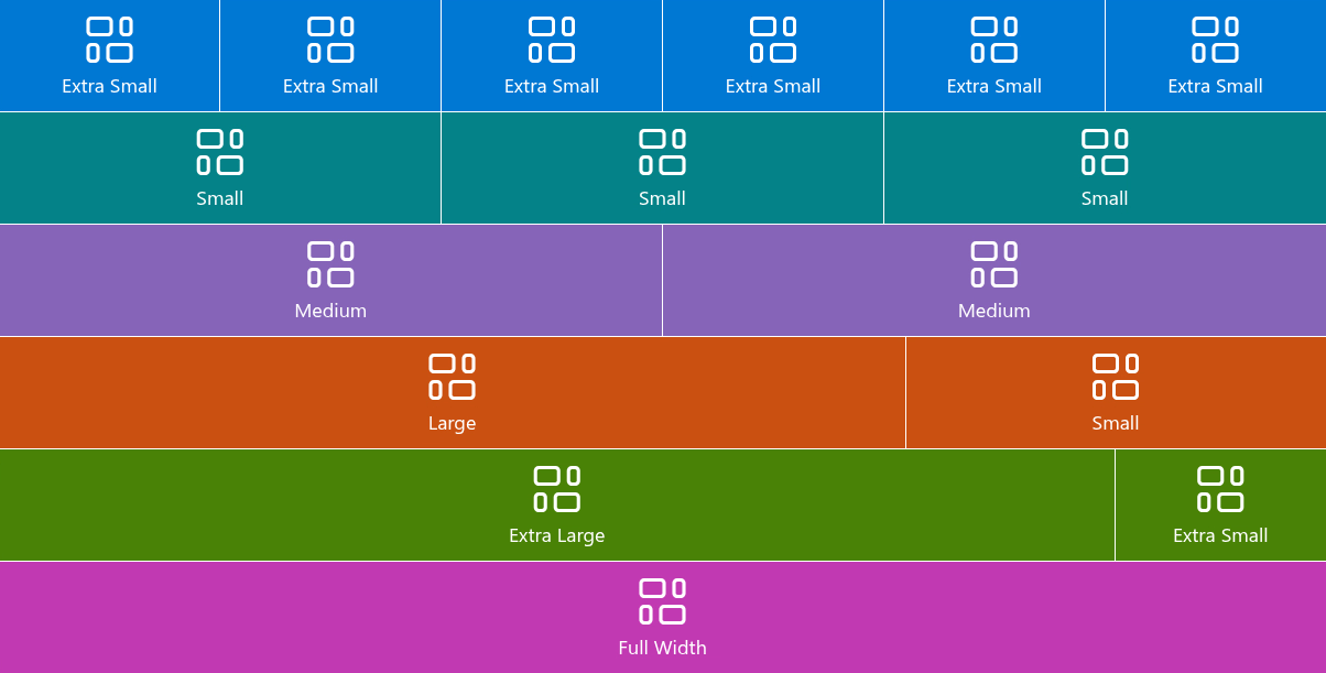
A new tile is Small.
How rows are filled
Two rules complete the picture:
- Tiles stretch to fill the row. The share in the table is a minimum. When a row has space left — two Small tiles alone in a row, say — the tiles grow to fill it, larger sizes growing faster than smaller ones. Rows are therefore always full, with no ragged right edge.
- A tile that does not fit moves to the next row. Three Small tiles fill a row; a fourth starts a new one. A Medium tile after two Small tiles does not fit in the remaining 40 % and starts a new row, where it stretches to the full width if nothing follows it.
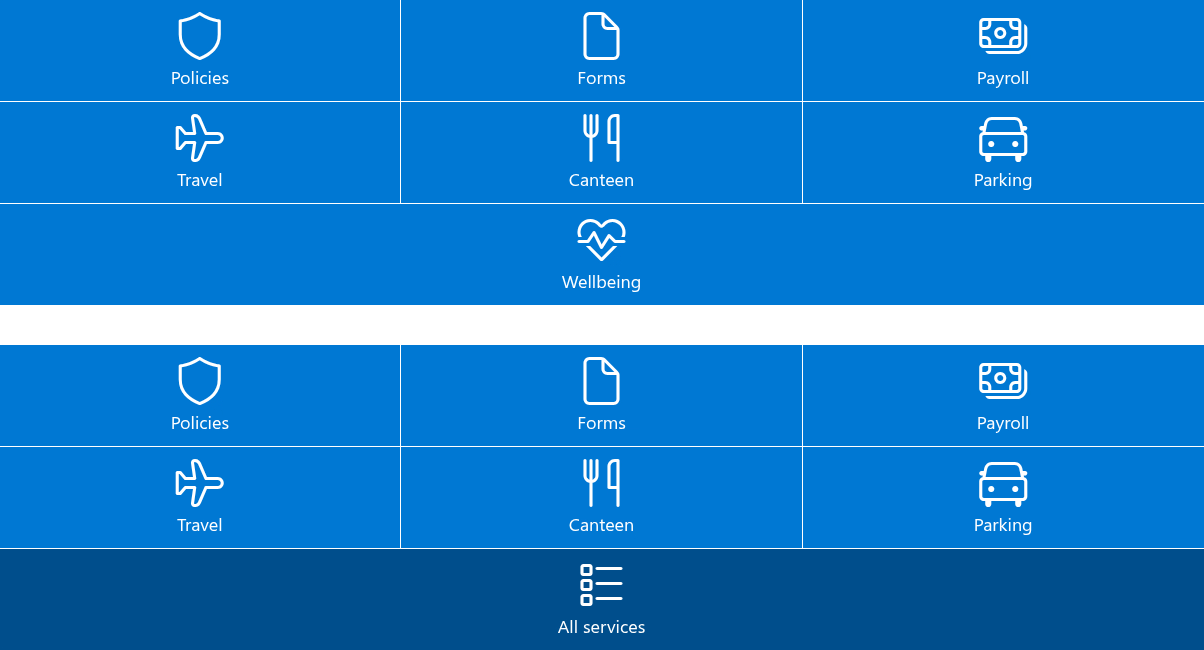
The second rule is the one that surprises: a single Small tile at the end of the panel will be stretched to a Full Width tile. Count the shares in each row — they should add up to about 90–100 % — or finish the panel with tiles that fill their row exactly.
📝 Note
The shares are relative to the width of the web part, not of the screen. In a two-column section the web part is half as wide, so three Small tiles still form one row — each of them half as wide as in a full-width section. On a phone, where the page is a single narrow column, tiles stay in the same rows and simply become narrower.
Height
The height of a tile is not set directly. It is the sum of the content — the icon at its Icon size, the title at its Font Size and the description, if shown — and the Internal Indent above and below the content. All tiles in a row are the same height, that of the tallest.
To make tiles taller without enlarging the icon or the text, increase Internal Indent; to make them square-ish, combine a large Internal Indent with Small or Extra Small tiles.
The three indents
The Appearance group of the property pane has three spacing settings, each from 0 to 30 pixels:
| Setting | What it spaces |
|---|---|
| Internal Indent | Above and below the content of a tile — the "padding". It decides the height of the tiles. |
| Icon Indent | Between the icon and the title. |
| External Indent | Between neighboring tiles, horizontally and vertically — the "gap". At 0 the tiles touch and the panel becomes a solid mosaic; at 10–16 the tiles read as separate cards. |

Layout recipes
Quick links bar. Six Extra Small tiles, External Indent 4, Internal Indent 8, titles shown, descriptions hidden. One row of compact buttons under the hero of a home page.
Department panel. A Full Width tile as the heading of the panel — a photo background and the name of the department — followed by rows of three Small tiles with the department's services. External Indent 8.
Featured plus list. One Large tile with a background image and a description, and one Small tile beside it; below, two rows of three Small tiles. The Large tile draws the eye to the most important link.
Mosaic. Mixed Extra Small and Small tiles with External Indent 0, all in accent colors, icons only (titles hidden). Looks best in a full-width section on a communication site.
💡 Tip
Build the panel in a full-width section when it is the main navigation of the page; see KB10042. How to Add and Configure the Smart Tiles Web Part. For the texts on the tiles, see KB10249. Showing Titles and Descriptions on Tiles.
❗ Important
Check the panel at a narrow window width before publishing — drag the browser window narrower or use the mobile preview of the page. Long titles that fit a Full Width tile are cut off with an ellipsis on a Small tile; the description, when it does not fit, is cut off in the same way.
Learn more about the product: https://vitextra.com/en/products/smart-tiles