 Smart Tiles
 Introduction
A tile that reacts when the pointer reaches it tells the visitor "this is a button" before they click. Smart Tiles offers nine such reactions, from a gentle dimming to a full color inversion, each with an adjustable strength and a transition time. This article describes the settings, what each effect does and which combinations work well.
Enabling the effect
- Open the page in edit mode and click Edit web part to open the property pane.
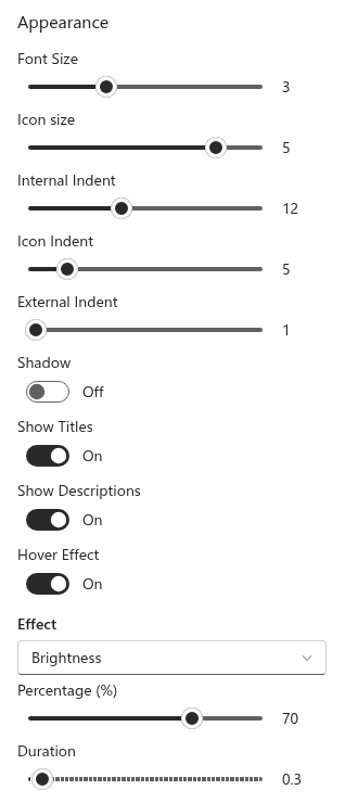
- In the Appearance group, switch on Hover Effect. Three more controls appear below the toggle.
- Choose the effect in the Effect list.
- Set the strength with the slider under the list. Its label — Percentage (%), degrees or pixels — depends on the effect.
- Set the Duration of the transition, from 0 to 5 seconds in steps of 0.1.
Move the pointer over a tile on the page to see the result; the settings are applied immediately.
The nine effects
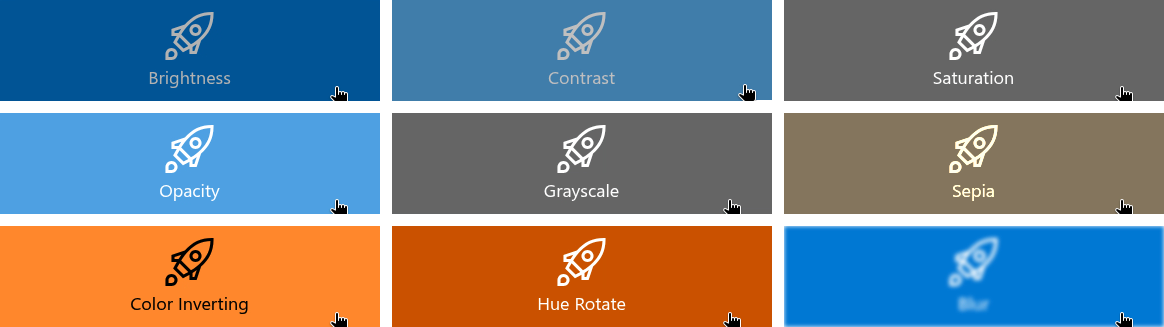
The effects are the image filters of the browser applied to the whole tile — background, icon and texts together. They fall into two groups by what their strength means.
Effects where 100 % is the original. Lower values reduce the property; the tile returns to normal when the pointer leaves.
| Effect | At lower values |
|---|---|
| Brightness | The tile darkens. 70–85 % is a classic "pressed" look; 0 % is black. |
| Contrast | Colors flatten toward gray. 50 % gives a soft, washed-out tile. |
| Saturation | Colors fade toward gray while brightness is kept. 0 % is a monochrome tile. |
| Opacity | The tile becomes translucent and the page shows through. 70–80 % is subtle; 0 % makes the tile vanish. |
Effects where 0 % is the original. Higher values apply more of the effect.
| Effect | At higher values |
|---|---|
| Grayscale | Colors are removed; 100 % is a black-and-white tile. |
| Sepia | The tile takes a warm brownish tint; 100 % is a fully sepia-toned tile. |
| Color Inverting | Colors are inverted; 100 % turns a white tile black and blue into orange. 20–30 % gives a noticeable but not jarring change. |
Effects with other units.
| Effect | Unit and behavior |
|---|---|
| Hue Rotate | Degrees, 0–360. Shifts every color of the tile around the color wheel: at 180° blue becomes orange and green becomes magenta; 360° is the original again. Small values (15–30°) give a lively shift that stays in the family of the original color. |
| Blur | Pixels, 0–20. Softens the tile; 1–2 px is a gentle focus change, 5 px and more makes the title unreadable. |
The strength of each unit is remembered separately: switching from Brightness at 70 % to Hue Rotate and back restores the 70 %.
Duration
Duration is the time the tile takes to change from its normal look to the effect — and back again when the pointer leaves. At 0 the change is instant; 0.2–0.4 s feels responsive; anything above 1 s feels slow for navigation. The transition runs in both directions, so a tile never "snaps" back.
Keyboard and accessibility
The effect is applied not only under the pointer but also when a tile receives keyboard focus, so visitors who navigate with the Tab key get the same feedback as those with a mouse.
When the operating system is set to reduce motion — Reduce motion on macOS and iOS, Animation effects off in Windows — the transition is skipped: the effect still appears, but instantly, without animation.
📝 Note
Effects are set per web part. Two Smart Tiles web parts on the same page can use different effects, or one of them none at all.
Recommended settings
- Default choice: Brightness 80 %, Duration 0.2 s. Works on colored tiles, on photographs and in dark themes.
- Subtle, for monochrome panels: Contrast 60 % or Saturation 40 %, Duration 0.3 s. The hovered tile softens without changing its color.
- Playful: Hue Rotate 20°, Duration 0.4 s. The tile shifts to a neighboring hue and back.
- Photo tiles: Opacity 85 % or Brightness 75 %; Blur 1 px gives a lens-like focus change.
- Avoid Color Inverting and Hue Rotate at high values on tiles with brand colors — the hovered tile shows colors that are not yours.
❗ Important
The effect changes the whole tile, including the text. Check that the title stays readable at the chosen strength — Brightness below 50 % or Opacity below 60 % makes white text on a dark tile hard to read at the very moment the visitor is about to click.
💡 Tip
The other settings of the Appearance group are described in KB10042. How to Add and Configure the Smart Tiles Web Part.
Learn more about the product: https://vitextra.com/en/products/smart-tiles