 List Filter Online
 Introduction
The filter pane is the part of List Filter Online that end users see most. An administrator selects the columns of the list that are worth filtering by and assigns a control to each of them; the users then narrow the list with drop-downs, date pickers, people pickers and sliders instead of typing CAML or opening several column menus in a row.
This article is a reference for that pane. It describes how the columns and controls are selected in the property pane, how each of the controls looks and behaves, which comparison the web part sends to SharePoint Online for it, and which controls are offered for each SharePoint column type. The general configuration of the web part is covered in KB10201. Configuring the List Filter Online Web Part.
Configuring the filter pane
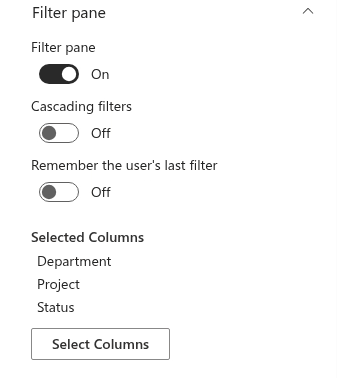
The filter pane is configured in the Filter pane group of the property pane. The group holds three toggles and the column configurator:
- Filter pane — shows or hides the pane on the page. The pane is also hidden automatically when no columns are selected for it.
- Cascading filters — narrows the value lists of the drop-down controls by the filters selected in the other controls of the pane; see KB10256. Cascading Filters in List Filter Online.
- Remember the user's last filter — restores the filter a user applied on the previous visit; see KB10253. Saved Filters and Filter Links.
- Selected Columns — the list of columns currently in the pane (or Not Selected), followed by the Select Columns button that opens the configurator.
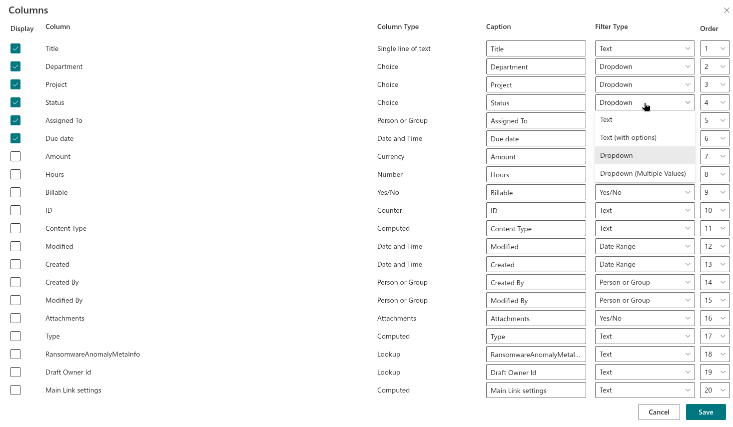
The Select Columns button opens the Columns panel. It lists every column of the selected list or library that SharePoint marks as filterable, except system columns and the hidden text columns that accompany managed metadata columns. Each row has the following fields:
| Field | Purpose |
|---|---|
| Display | The check box that puts the column into the filter pane. Selected columns move to the top of the list when the panel is reopened. |
| Column | The name of the column in the list. On lists over 5,000 items a warning icon appears next to a column that is not indexed; see KB10257. Filtering Large Lists: Indexed Columns and the 5,000-Item Threshold. |
| Column Type | The SharePoint type of the column, for information. |
| Caption | The label shown above the control in the pane. By default it is the column name; change it when the users know the data under a different name or when the name is too long for the pane. |
| Filter Type | The control used for the column. The list offers only the controls that fit the column type (see the matrix below). The default control depends on the type as well. |
| Order | The position of the control in the pane, as a number. Choosing a new number moves the column to that position and renumbers the others. |
Save applies the selection to the web part; Cancel closes the panel without changes. Columns that are not checked are not stored, so clearing a check box also discards the caption and control chosen for that column.
📝 Note
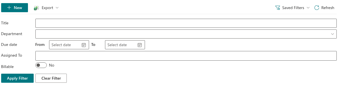
Filters set in the pane take effect when the user clicks Apply Filter; changing a control does not reload the list by itself. Clear Filter resets every control and reloads the list without user filters. The conditions of the pane are joined with AND, both with each other and with the predefined filter built by the administrator in the Filter group. Applied conditions are shown as filter chips above the results, each with its own clear button and a Clear all the filters link.
Filter controls
The following sections describe each control that can be chosen in the Filter Type list: what the user sees, how a value is entered, and the comparison that the web part puts into the CAML query. The CAML element names (Eq, Contains, In, Geq and so on) are given for administrators who read the query in the CAML Query dialog of the developer mode or who build the predefined filter in the Query Builder.
Text
A single text box. The user types a fragment of the value; the comparison is Contains (Contains) with the typed text. This is the default control for text, number, currency, lookup, hyperlink, calculated and ID columns. Because Contains cannot use a column index, prefer another control for large lists (see KB10257).
Text (with options)
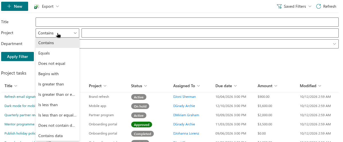
A drop-down of operators followed by a text box (up to 300 characters). The operators are Contains (Contains), Equals (Eq), Does not equal (Neq), Begins with (BeginsWith), Is greater than (Gt), Is greater than or equal to (Geq), Is less than (Lt), Is less than or equal to (Leq), Does not contain data (IsNull) and Contains data (IsNotNull). The text box disappears for the last two operators, since they need no value. The default operator is Contains; an operator with an empty text box adds no condition.
Dropdown
A drop-down list of the values that actually occur in the column. The values are loaded from the list the same way the column header menu of a native SharePoint view loads them, respect the current folder and, with Cascading filters on, the filters selected in the other controls. The list begins with three fixed entries — (All) (no condition), Contains data (IsNotNull) and Does not contain data (IsNull) — followed by a divider and the values. Choosing a value produces Equals (Eq). This is the default control for choice columns.
Dropdown (Multiple Values)
A combo box in which several values can be checked; the selected values are shown in the box separated by commas. The condition is In (In with a Values list), so an item matches when the column holds any of the checked values. The value list is loaded and narrowed in the same way as for Dropdown. The fixed entries (All), Contains data and Does not contain data are not offered here.
Date picker
A drop-down of operators and, for the operators that need a date, a calendar picker that follows the date format and first day of the week of the regional settings of the site. The operators are Contains data (IsNotNull), Does not contain data (IsNull), On (Eq), Not on (Neq), On or after (Geq), After (Gt), On or before (Leq) and Before (Lt). The date is sent without a time part, so the comparison is made by day.
❗ Important
The default operator of the Date picker is Contains data, and this condition is applied automatically as soon as the page opens. Items whose date column is empty are therefore hidden until the user changes the operator or clears the filter. Use Date Range when empty dates must remain visible by default.
Date Range
Two calendar pickers labeled From and To. Either of them can be left empty. The start date produces After (Gt) and the end date produces Before (Lt); both boundaries are exclusive, so items dated exactly on the From or To day are not included, and the user has to choose a day earlier or later to include them. The picker does not let the user choose an end date earlier than the start date. This is the default control for date and time columns and it adds no condition until a date is selected.
Relative Date
A drop-down of periods relative to the current day, followed by a number box for the periods that need one: Last X Days, Last X Weeks, Last X Months, Last X Years, Today, Next X Days, Next X Weeks, Next X Months and Next X Years. Today produces Eq with the CAML <Today /> value; the other periods produce a pair of comparisons (Geq and Leq) between the computed boundary date and today. The number can be up to 1,000.
📝 Note
The default period of the Relative Date control is Today, and it is applied automatically when the page opens: the list initially shows only the items whose date is today. Choose this control for columns where "today" is the natural starting point, such as a due date or an event date.

Person or Group
A compact people picker. The user types a part of a name and picks a person from the Suggested People list; the picker searches the users of the site. In the single-value variant one person can be selected, in Person or Group (Multiple Values) up to twenty. The condition is In on the user ID (FieldRef LookupId="TRUE"), so a multi-value column matches when it contains any of the selected people. This is the default control for person or group columns.
📝 Note
The picker suggests users only; SharePoint and Microsoft 365 groups cannot be selected in the filter pane even when the column allows groups. To filter such a column by a group name, assign the Dropdown or Text control instead.
Term
A tag picker for managed metadata columns. The user types a part of a term label and picks a term from the term set bound to the column; deprecated terms are not suggested. Term accepts one term and produces Contains (Contains) with the term label; Term (Multiple Values) accepts up to twenty terms and produces In with the labels. This is the default control for managed metadata columns.
Numeric range
A two-handle slider. When the pane loads, the web part reads the smallest and largest value of the column in the list (within the current folder) and uses them as the ends of the slider; the step is 1 for whole-number columns and 0.1 for other numbers and currency. Moving the handles produces Is greater than or equal to (Geq) for the lower value and Is less than or equal to (Leq) for the upper value, with the type of the column.
Yes/No
A toggle with the labels Yes and No. The condition is Equals (Eq) with 1 or 0. An untouched toggle adds no condition; once the user has switched it, the current position is sent, so switching it back to No filters the list to items with the value No rather than removing the filter. Clear Filter removes the condition. This is the only control for yes/no columns and for the Attachments column, where Yes means "has attachments".

Column types and available controls
The Filter Type list of the configurator offers the following controls for each SharePoint column type. The control in bold is the default.
| Column type | Available controls |
|---|---|
| Single line of text, Title | Text, Text (with options), Dropdown, Dropdown (Multiple Values) |
| Multiple lines of text | Not listed — SharePoint does not allow filtering by this column type |
| Choice (single and multiple selection) | Text, Text (with options), Dropdown, Dropdown (Multiple Values) |
| Number, Currency | Text, Text (with options), Numeric range |
| Date and Time, Created, Modified | Date picker, Date Range, Relative Date |
| Yes/No | Yes/No |
| Person or Group (single and multiple), Created By, Modified By | Person or Group, Person or Group (Multiple Values), Text, Text (with options), Dropdown, Dropdown (Multiple Values) |
| Lookup (single and multiple) | Text, Text (with options), Dropdown, Dropdown (Multiple Values) |
| Managed Metadata (single and multiple) | Text, Text (with options), Term, Term (Multiple Values), Dropdown, Dropdown (Multiple Values) |
| Hyperlink or Picture | Text, Text (with options) |
| ID | Text, Text (with options) |
| Attachments | Yes/No |
| Calculated | Text, Text (with options), Dropdown, Dropdown (Multiple Values) |
| Approval status | Not listed — the column is treated as a system column |
| Likes, rating columns | Text |
Columns of other types — content type ID, GUID, workflow and threading columns — may appear in the list when SharePoint marks them as filterable, but their Filter Type list is empty and they should not be selected. Columns with multiple values (choice with multiple selection, multi-value lookup, person or group with multiple selection, multi-value managed metadata) receive the same controls as their single-value counterparts; a condition matches an item when any of its values satisfies it.
❗ Important
On lists and libraries with more than 5,000 items SharePoint can refuse a query that filters by a column without an index. The configurator marks such columns with a warning — "The column is not indexed. Filtering a large list by this column may not work." — and lets you create the index on the spot. Indexes, the threshold and the related design rules are described in KB10257. Filtering Large Lists: Indexed Columns and the 5,000-Item Threshold.
Related articles
The filter pane is one of three ways to filter the list in List Filter Online. The column header menu offers sorting and a filter by values for every column marked Filterable, and the administrator can fix a permanent condition in the Query Builder.
💡 Tip
To build a predefined filter that every user gets — for example, only active records of the current department — see KB50025. How to Build a Complex Query with the List Filter Online Query Builder. To make the drop-down values depend on each other, see KB10256. Cascading Filters in List Filter Online. For the people who will use the pane, see KB10252. List Filter Online: Quick Guide for End Users.