 List Filter Online
 Introduction
List Filter Online does not use the views of a SharePoint list or document library. Instead, the web part keeps its own definition of the table it shows: which columns are included, in which order, under which captions, how each column behaves and how its values are formatted. All of this is set in one place — the column configurator in the property pane.
This article describes every option of the column configurator, the display formats available for each column type and the appearance settings that affect the whole table. It applies to List Filter Online version 26.10 and later.
📝 Note
The column settings belong to the web part instance on the page. They do not change the list, its columns or its views, and the same list can be shown with different columns and formats on different pages.
Opening the column configurator
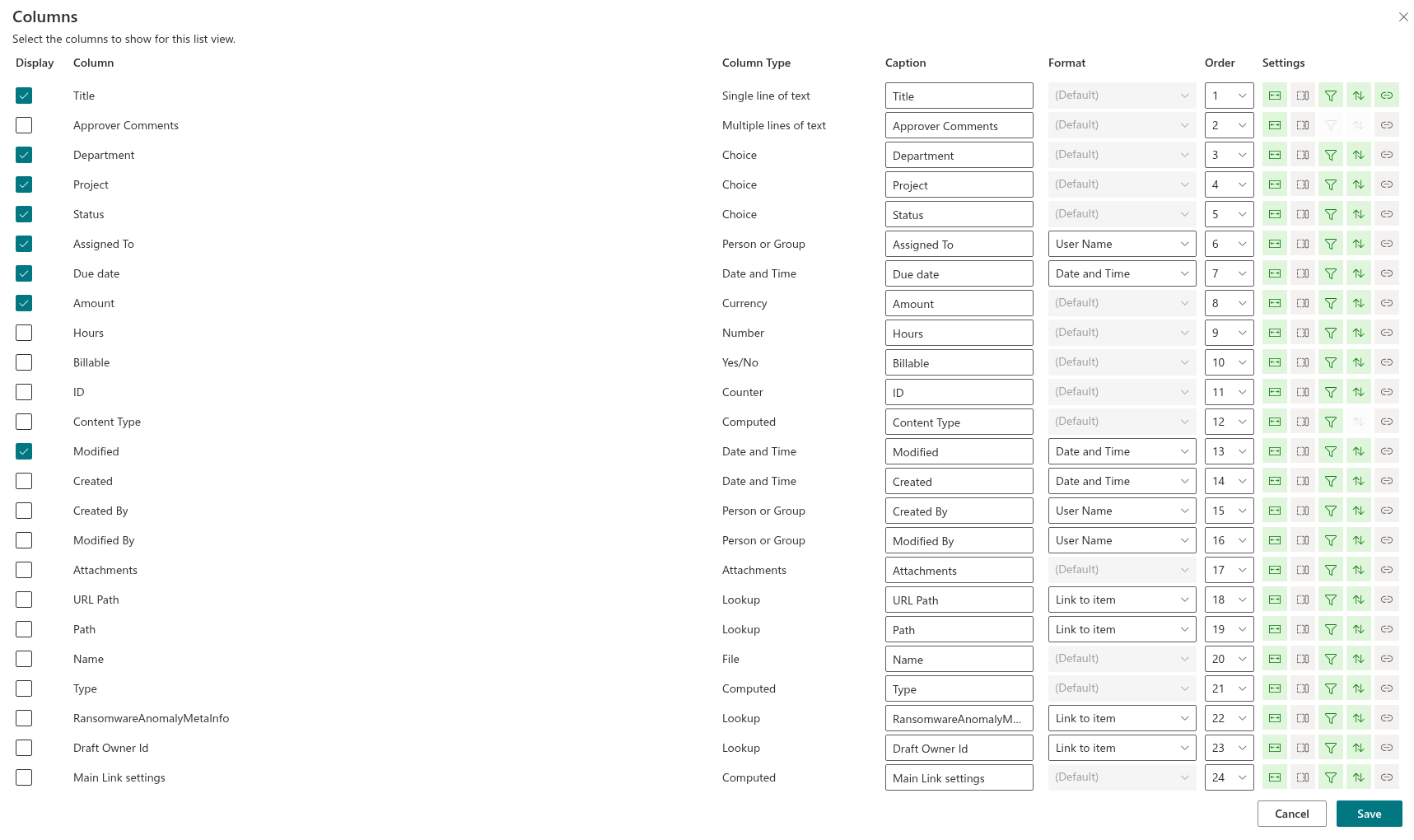
Edit the page, open the property pane of the web part and expand the Data Source group. Once a List is chosen, the group shows the Columns label with the names of the columns that are currently included, followed by the Select Columns button. The button opens the Columns panel with the text "Select the columns to show for this list view." and one row per column of the list.
Each row has the following parts:
- Display — a check box that includes the column in the table or removes it;
- Column — the name of the column in the list;
- Column Type — the SharePoint type of the column, such as Single line of text or Person or Group;
- Caption — the heading shown in the table;
- Format — the display format of the values;
- Order — the position of the column in the table;
- Settings — the behaviour options of the column, shown as icons.
Changes are applied with Save and discarded with Cancel. Only the columns with Display checked are kept in the web part.
System columns that cannot be displayed, such as internal metadata fields, are not listed. Hidden text fields that SharePoint creates for managed metadata columns are also skipped: a managed metadata column appears once, under its own name.
When Enable developer mode is switched on in the Developer tools group, each row additionally shows an index indicator in front of the column name and the internal (schema) name of the column in square brackets after it. The indicator is green for an indexed column and red for a column that is not indexed; its tooltip reads (Indexed) or (Not Indexed). Indexed columns matter when the web part works with large lists — see KB10257. Filtering Large Lists: Indexed Columns and the 5,000-Item Threshold.
Caption and order
Caption is the text shown in the column header. By default it equals the name of the column in the list; type anything else to rename the column for this web part only — for example, shorten "Document Modified Date" to "Modified". If the caption is left empty, the web part falls back to the name of the column. The caption is also used as the column header when the table is exported to Excel.
Order is a drop-down with the positions from 1 to the number of columns in the list. Selecting a new position moves the column there and shifts the other columns accordingly. When the panel is opened, the columns that are already included are listed first, in their current order, followed by the columns that are not displayed.
💡 Tip
Give the columns their final order before you fine-tune captions and formats: the row you are editing keeps its place, so the result in the table is easier to picture.
Behaviour options
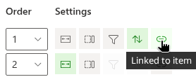
The Settings cell of each row holds five icons. A highlighted icon means the option is on; a dimmed icon means it is off. Click an icon to switch the option. Options that do not apply to the column are shown disabled and cannot be switched.
| Icon | Option | What it does |
|---|---|---|
| Fit width | Resizable | The user can drag the right edge of the column header to change the width of the column. On by default. |
| Column section | Collapsible | When the table is narrower than the sum of the column widths, the web part may hide this column instead of squeezing the others. Off by default. |
| Filter | Filterable | Adds the column to the header menu, where the user can pick values to filter by and clear the filter. Available only for columns that SharePoint allows to filter. |
| Sort | Can be sorted | Adds ascending and descending sort to the header menu. Available only for columns that SharePoint allows to sort. |
| Link | Linked to item | Renders the value as a link to the item: a document opens in a new tab (in the browser, or in the Stream player for a video), a list item opens its display form in a new tab, and a folder opens inside the web part. Not available for Thumbnail and Hyperlink or Picture columns. On by default for the Title column. |
A column with Filterable or Can be sorted switched on gets a drop-down arrow in its header; a column with both switched off has no header menu. Filtering and sorting by the header menu are described in KB10252. List Filter Online: A Quick Guide for End Users.
Multi-line text columns are rendered as multi-line cells automatically: the text wraps inside the cell instead of being cut off. There is no separate option for this; it follows the column type. For an append-only multi-line column (one with "Append changes to existing text" enabled), the stored text is rendered with its formatting.
Formats per column type
The Format drop-down offers the display formats that make sense for the type of the column. For most column types there is only one way to show the value; the drop-down then shows (Default) and is disabled. The first format in the list is the one used when nothing else is chosen.
| Column type | Formats | Result in the table |
|---|---|---|
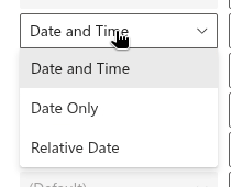
| Date and Time | Date and Time (default), Date Only, Relative Date | Date and Time shows the date with the time of day, Date Only shows the date alone, and Relative Date shows the distance from now, such as "3 days ago" or "in 2 months". In all three cases the exact date and time appear in the tooltip of the value. |
| Lookup (single and multiple values) | Link to item (default), Value | Link to item renders each value as a link that opens the display form of the item in the source list in a new tab. Value shows the text only. Multiple values are listed one under another. |
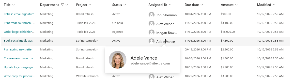
| Person or Group (single and multiple values) | User Name (default), User Name (with picture), User Name (with picture and details) | User Name shows the display name. The two picture formats show a small profile picture with the display name and the job title. In every format, clicking the name opens the profile card described below. |
| Thumbnail (the Thumbnail column of a document library and Image columns) | 176 x 99 px (default), 96 x 54 px | A preview of the document or image at the chosen size. For an Image column the preview is a link that opens the image file in a new tab. |
| Hyperlink or Picture, displayed as hyperlink | (Default) | A link with the description as its text or, when there is no description, the address. |
| Hyperlink or Picture, displayed as picture | 32 x 32 px (default), 64 x 64 px, 96 x 96 px | The picture at the chosen size, linked to the picture file. |
| All other types | (Default) | The value as SharePoint renders it in the list: text, numbers, currency, Yes/No, choices, managed metadata labels, calculated values, ratings. Multiple choices and multiple managed metadata values are separated by commas. |
Some built-in columns have a fixed rendering of their own regardless of the format: Type (the document icon) shows the file-type icon of a document, a colored folder icon for a folder and a generic item icon for a list item; Attachments shows a paper-clip icon that opens the list of attachments of the item; File Size shows a human-readable size such as 2.4 MB; ID shows the item number in a narrow column; the media columns of a library show the duration of a video and the date a photo was taken.
The profile card of a person
Every Person or Group value in the table is clickable. Clicking it opens a card with the profile picture of the user, the display name, the job title, the department and the work phone, loaded from the user profile. When the profile service is not available, the card shows the name and the user principal name instead. The card closes when you click outside of it.
Column widths
Column widths are not set in the configurator. The web part assigns a starting width by the type of the column: regular columns take between 80 and 400 pixels, date columns between 80 and 160 pixels, the ID column between 40 and 60 pixels, and the icon columns Type and Attachments a fixed 20 and 18 pixels. Thumbnail and picture columns are as wide as the chosen format and cannot be resized. Within these limits the columns share the available width of the web part.
Users change the width of a Resizable column by dragging the edge of its header. The new width lasts until the page is reloaded; it is not stored.
Compact mode
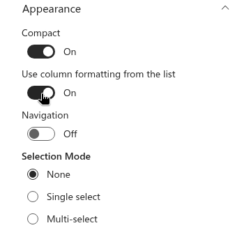
The Appearance group of the property pane has the Compact toggle, switched on by default. In compact mode the rows and group headers are lower, so more items fit on the screen. Switch it off for a more spacious table, for example when a Person or Group column uses a picture format or a column shows long multi-line text.
Column types without a dedicated rendering
❗ Important
The web part has a dedicated rendering for the common column types listed above. A column of any other type — for example a Location column or a column added by a third-party solution — is shown as its raw value in plain text, which may include the technical notation of the value. Check such columns on the page before you publish it, and leave them out of the table if the result is not readable.
Related articles
💡 Tip
If a column in the list has a column formatting JSON, the web part can apply it instead of the formats described here — see KB10259. Using SharePoint Column Formatting JSON in List Filter Online. Grouping, sorting and totals of the table are described in KB10260. Grouping, Sorting and Totals in List Filter Online, and the full configuration of the web part in KB10201. Configuring the List Filter Online Web Part.