Announcements Carousel
Introduction
The same set of announcements can be presented in different ways. On the home page, a compact carousel that takes up little space works best; in a narrow side column or on a department page, a list where everything is visible at once may be more convenient. The Announcements Carousel web part supports both scenarios.
This article explains the options in the Appearance and Behavior groups of the property pane that control how announcements are presented and how readers navigate them.
Choosing the Layout
The Layout option in the Appearance group offers two modes.
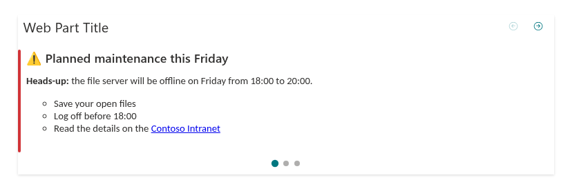
Carousel
One card is shown at a time. Readers switch between announcements with the controls described below. This mode is the default.
Choose Carousel when:
- the web part is placed in a prominent area of the home page and must not take up much space;
- there are several announcements, and each is important enough to occupy the whole card;
- you want to use autoplay.
Stacked
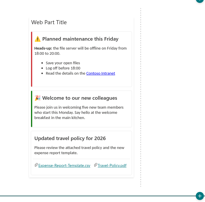
All announcements (within the Maximum items limit) are shown at once as a vertical list of cards. There are no navigation controls and no autoplay - readers simply scroll the page.
Choose Stacked when:
- the web part is placed in a narrow column of the page;
- readers must see all current announcements without clicking anything;
- there are only a few announcements, and they are short.
💡 Tip
In the Stacked layout, set a small Maximum items value, for example 3–5, so the web part does not stretch the page. See KB10575. Controlling Which Announcements Are Shown and in What Order.
Transitions
The Transition option defines the animation used when switching cards in the Carousel layout:
- Slide (default) - cards move horizontally, as in a classic slider;
- Fade - the current card fades out and the next one fades in smoothly.
Slide emphasizes the sequence of announcements, while Fade looks calmer and suits pages with a restrained design. The option is ignored in the Stacked layout.
Navigation
In the Carousel layout, readers can switch announcements in several ways:
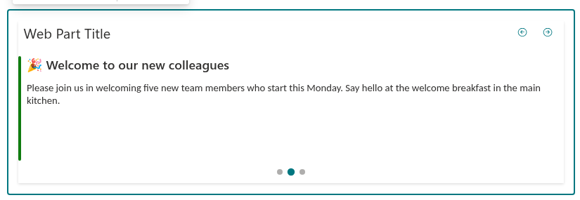
- Previous/next arrows in the web part header. On the first card, the "previous" button is unavailable; on the last card, the "next" button is unavailable.
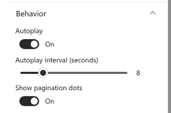
- Pagination dots under the card show the current position and let readers jump to any announcement. They are controlled by the Show pagination dots option in the Behavior group (on by default).
- Keyboard - when the carousel has focus, the ←/→ keys switch cards.
- Swipe - on touch devices, swipe the card left or right.
📝 Note
If there is only one announcement to show, the carousel does not display arrows, dots or the Play/Pause button - there is nothing to switch. On sites in right-to-left languages (Arabic, Hebrew), the direction of the arrows, keys and swipes is mirrored automatically.
Autoplay
Autoplay rotates announcements automatically, so readers see all the news without clicking anything. It is configured in the Behavior group:
- Autoplay - turns automatic rotation on or off (off by default);
- Autoplay interval (seconds) - the time each card is displayed, from 2 to 30 seconds, 5 by default. The slider is available only when autoplay is on.
Autoplay is designed to be convenient for readers:
- after the last card, the carousel returns to the first one;
- rotation pauses while the pointer is over the web part or while it has keyboard focus, so a reader can calmly finish reading;
- when autoplay is on, a Play/Pause button appears in the header, allowing readers to stop or resume rotation;
- while slides are rotating automatically, screen readers do not announce every change, so they do not interrupt the user.
❗ Important
Autoplay works only in the Carousel layout and only when there are at least two announcements. In the Stacked layout, the autoplay options are ignored.
💡 Tip
Choose the interval based on the length of the texts: 5–8 seconds is enough for a short headline with one or two sentences, while longer announcements need 10–15 seconds. If readers complain that cards change too quickly, increase the interval rather than turning autoplay off.
Recommended Configurations
| Scenario | Layout | Transition | Autoplay | Maximum items |
|---|---|---|---|---|
| Home page, full-width section | Carousel | Slide | On, 8–10 s | 5–10 |
| Home page, two-thirds section | Carousel | Fade | On or off | 5 |
| Side column, department page | Stacked | - | - | 3–5 |
| Microsoft Teams tab | Carousel | Slide | Off | 10 |
Conclusion
A layout, a transition and autoplay are enough to adapt the web part to any place on the page: a dynamic carousel for the home page or a compact list for a side column. Whatever you choose, readers keep full control: they can pause rotation, use the keyboard or swipe through the cards. For a complete overview of all web part options, see KB10221. Announcements Carousel: Features and Capabilities of the SharePoint Web Part.