 Announcements Carousel
 Introduction
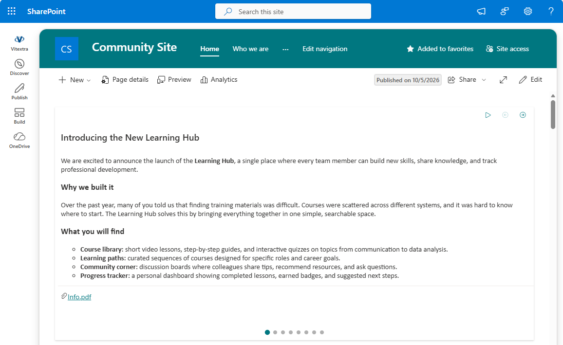
Timely announcements are the backbone of internal communication. The Announcements Carousel web part brings important news and updates to your SharePoint home page as a compact, eye-catching carousel. This article describes the product and all of its features in detail; if you are just getting started, read KB10208. Announcements Carousel: Getting Started first.
Overview
Announcements Carousel displays items from a native SharePoint announcements list as a set of cards that visitors can browse. The web part is built on the SharePoint Framework (SPFx) and is fully compatible with modern SharePoint Online sites.
📝 Note
The web part does not require any API permissions — it retrieves data through the built-in SharePoint REST API on behalf of the current user.
Data Source: Native SharePoint Lists
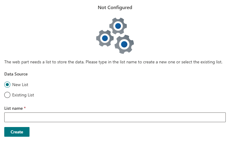
The web part works with standard SharePoint announcements lists. When you add it to a page, you can select an existing list or create a new one in a single click. This lets you reuse the data you already have and avoid duplicating it.
All announcements are managed in the standard Microsoft Lists app: the title, rich text body, attachments and expiration date are set with familiar SharePoint tools. This also means list permissions and Power Automate automation are available out of the box.
💡 Tip
Because the data is stored in Microsoft Lists, you can build Power Automate flows — for example, to send notifications whenever a new announcement is added. For details on creating and configuring the list, see KB10208. Announcements Carousel: Getting Started.
Displaying Announcements
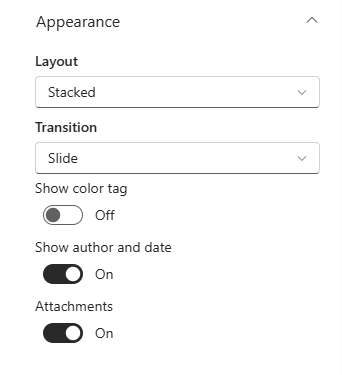
The web part supports two layout modes, selected with the Layout option:
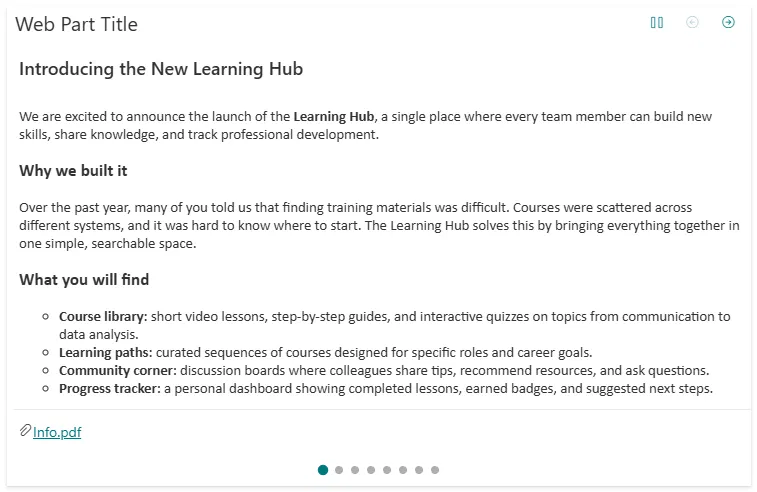
- Carousel — one card at a time with navigation controls. Ideal for a home page where space matters.
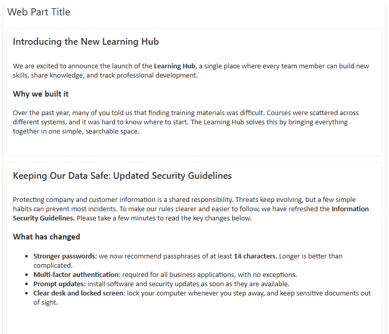
- Stacked — all announcements are shown as a continuous vertical list of cards. Useful when readers should see everything at once without paging.
In Carousel mode, two transition styles are available (the Transition option): Slide, where cards move horizontally, and Fade, where they cross-fade smoothly.
Navigation
In Carousel mode, visitors can browse announcements in several ways that work simultaneously:
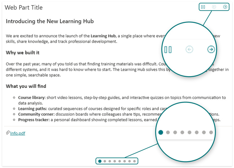
- Previous/next arrows in the web part header.
- Pagination dots below the carousel show the current position and let visitors jump straight to any announcement (the Show pagination dots option).
- Keyboard — the ←/→ arrow keys switch cards when the carousel has focus.
- Touch gestures — on touch devices, cards can be swiped.
Autoplay
The carousel can rotate automatically. The Autoplay option turns this mode on, and Autoplay interval (seconds) sets the pause between slides (from 2 to 30 seconds).
Autoplay is predictable and respectful of the reader: it pauses when the pointer hovers over the web part or when it receives focus, and the Play/Pause button in the header lets visitors stop or resume rotation manually.
📝 Note
Autoplay works only in the Carousel layout and only when there is more than one announcement.
Card Appearance
An announcement card can show more than a title and body text. Additional elements are turned on with toggles:
- Author and date — a meta line with the author's name, the creation date and an expiration indicator.
- Attachments — a list of files attached to the announcement, with links to open them.
Filtering and Ordering Announcements
The web part filters and orders announcements before displaying them:
- Sorting (the Sort by option): Priority (by the list's Order field), Newest first, Oldest first or Title (A-Z). Priority is the default, so you can manually control the order of important announcements.
- Approved items only — if content approval is enabled for the list, the web part shows only approved items by default and hides pending and rejected ones.
- Maximum items — limits the number of announcements displayed (from 1 to 50).
- Expiration — announcements whose Expires date has passed are hidden automatically.
❗ Important
Expiration and moderation filters are applied both in the SharePoint query and in the web part. If content approval is enabled for the list, make sure authors have permission to approve (publish) items — otherwise their announcements will not appear to readers.
If there are no active announcements for readers, the web part hides itself automatically in Read mode, leaving no empty block on the page. In Edit mode, an explanatory message is shown instead.

Accessibility, Theming and Localization
- Accessibility — the carousel uses proper ARIA roles and an
aria-liveregion, supports keyboard control and focus handling; hidden slides are not announced by screen readers. - Right-to-left (RTL) languages — controls and layout automatically adapt to RTL locales (Arabic, Hebrew and others).
- Localization — the interface is translated into more than 50 languages and follows the language of the SharePoint site.
- Theming — the web part inherits the current site theme and integrates with SharePoint Brand Center, keeping your corporate branding consistent.
Configuration: The Property Pane
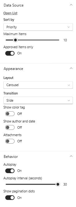
All options are grouped in the web part property pane:
- Data Source — a link to open the list, sorting, maximum items, approved items only.
- Appearance — layout, transition style, author and date, attachments.
- Behavior — autoplay, autoplay interval, pagination dots.
- About — license and version information.
Summary of the main options:
| Option | Group | Purpose |
|---|---|---|
| Sort by | Data Source | Order: priority, newest/oldest, by title |
| Maximum items | Data Source | Limit the number of announcements shown (1–50) |
| Approved items only | Data Source | Hide items that have not passed moderation |
| Layout | Appearance | Carousel or Stacked |
| Transition | Appearance | Slide or Fade |
| Show author and date | Appearance | Announcement meta line |
| Attachments | Appearance | List of attached files |
| Autoplay | Behavior | Automatic slide rotation |
| Autoplay interval (seconds) | Behavior | Pause between slides, 2–30 s |
| Show pagination dots | Behavior | Position indicator dots |
Licensing
The web part follows a trial-then-activate licensing model. The license status and version are shown in the About group of the property pane, which also displays a notification when a new version is available.
💡 Tip
To deploy Vitextra cloud products in your environment, see the KB10035. Installing Cloud-based Product article.
Conclusion
Announcements Carousel turns an ordinary SharePoint announcements list into a prominent, convenient element of your home page. Flexible layouts, autoplay, priority sorting, support for moderation and expiration, accessibility and localization make the web part a reliable internal communication tool — with minimal effort to set up and maintain.